

Problem-driven lead: when signs fail both structurally and functionally
Buildings are systems that carry weight — literal and human. Too often, wayfinding signs buckle under two pressures at once: material fatigue and poor accessibility. A sign meant to guide becomes an obstacle when its tactile characters wear away, or when poor mounting height and low contrast make it unreadable. Addressing these failures means treating signage as both a load-bearing element and a human interface, which is why ada braille signs deserve scrutiny from engineers and designers alike. The urgency is practical: roughly one in four U.S. adults has a disability, and ADA guidelines require tactile signage in public buildings — so robustness and clarity are not optional.
Diagnosing the common failure modes
Failure often starts small: a loose fastener, an exposed edge, or fading contrast. Over time these translate into unreadable braille and blunt tactile characters. Corrosion, improper adhesive selection, and incorrect mounting height amplify the problem. Facilities that skip scheduled audits trade short-term savings for long-term replacement costs. A focused structural lens reveals the same categories of failure we see in other systems: fatigue, misalignment, and incorrect material selection.
Design choices that reduce stress and improve legibility
Good choices are simple and measurable. Specify materials rated for the environment — corrosion-resistant metals for humid transit hubs, UV-stable substrates for sun-drenched facades. Maintain minimum contrast ratios and ensure tactile characters meet depth and spacing recommendations. For tactile signage, use rounded edges and secure mechanical fastenings rather than adhesives alone. These details reduce maintenance cycles and preserve legibility for longer.
Implementation: how to audit and retrofit effectively
Begin with a concise audit checklist: structural attachment points, surface contrast, braille accuracy, and mounting height. Prioritize high-traffic nodes — concourses, elevator banks, emergency exits — where failures matter most. Retrofitting should favor modular solutions that allow component replacement without full removal. Hospitals and universities that adopt this method often see fewer service interruptions and clearer compliance outcomes.
Operational lessons from real-world anchors
Anchoring practice to regulation and data keeps decisions grounded. The Americans with Disabilities Act sets baseline tactile and braille requirements; following them reduces liability and improves usability. On the operational side, organizations that schedule quarterly inspections report fewer emergency repairs. These are practical, verifiable outcomes that tie design choices back to measurable performance.
Material and product comparisons
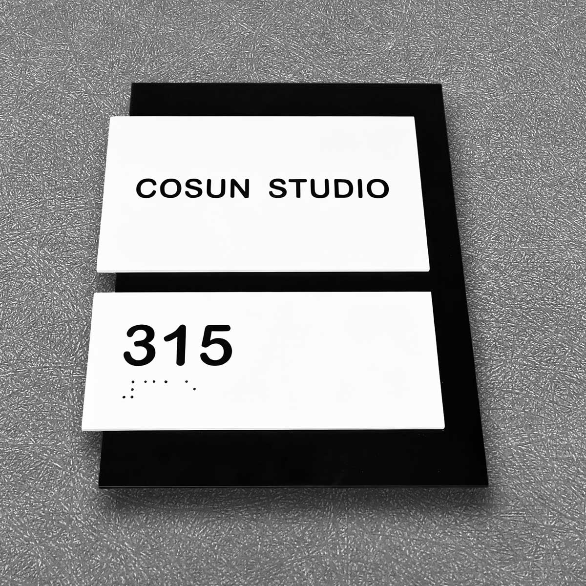
Comparing options helps choose the right tool for the problem. Laser-etched acrylic offers crisp tactile characters and low maintenance; engraved metal holds up in harsh conditions but needs corrosion protection. LED-illuminated sign panels solve nighttime visibility but require sealed enclosures to protect electronics. Each choice trades one set of stresses for another — pick the one aligned to the site’s environmental profile and maintenance capacity. Consider also ready-made ADA-compliant solutions such as ada braille room signs for consistent performance.
Common mistakes and how to avoid them
Teams often under-spec mounting hardware, ignore cleaning protocols, or accept noncompliant braille spacing to save cost. Avoid these shortcuts. Set clear procurement standards, require verification of braille accuracy at installation, and document mounting height and fastener specs in facility records. Small investments here cut replacement cycles dramatically — and improve daily experience for people navigating the space.
Advisory: three metrics to evaluate signage choices
Measure three things before you commit: longevity (expected service life under local conditions), legibility (contrast ratio and tactile compliance), and maintainability (modular repairability and parts availability). Choose solutions that score well across all three; a high mark in only one area invites future failure. These rules steer selection toward resilient, accessible signage that performs under both structural stress and daily use. Final thought — real value comes from signs that keep working, quietly and reliably.
Cosun Sign offers practical options that align with these criteria — durable builds, tested tactile characters, and a track record of installations in varied public spaces. —